Opinion wanted Quietness

  • Thread starter Morexp57
  • Start date
  • Watchers 3

Welcome to Explorness!

Looking for a peaceful place to meet other photographers from all around the world ? Then join us for FREE!!!

The member has asked your opinion about his/her photo(s) attached in the topic.
Morexp57

Morexp57

Member
1
Feb 12, 2022
711
1,095
Edit my images
Yes
Location
Europe
Camera type
Mirrorless camera
Camera sensor
Full-frame
Yesterday afternoon (24 November 2022), despite the cool temperature, it was tempting to sit for a while in front of this landscape.
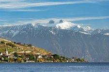
My favourite subject at the moment, the Towers of Mayen and Ai. This time seen from Lutry on the shores of Lake Léman.
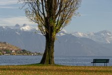
PLR_3314_DXO.jpg
ISO 64, f/11.0, 1/13 s, 135 mm
 
Andy Smith

Andy Smith

Member
1
Feb 10, 2022
568
848
Edit my images
No
Nice Morexp57, although personally i think the tree blocks the great view and doesn't really add anything to the image. The bench is great but I am not a fan of the tree.
 
Morexp57

Morexp57

Member
1
Feb 12, 2022
711
1,095
Edit my images
Yes
I understand your point of view. But I couldn't resist the colours of its last leaves.
 
Morexp57

Morexp57

Member
1
Feb 12, 2022
711
1,095
Edit my images
Yes
Thank you ruedas ruedas, I like the two pictures with a small preference for the one with the tree and the bench.
 
Andy Smith

Andy Smith

Member
1
Feb 10, 2022
568
848
Edit my images
No
I prefer the first images foreground and overall composition, I love the bench but just find the tree to be smack bang in the middle and distracting my eye. Don't get me wrong, I do like the tree but just not in the centre of the image. :)
 
panos_adgr

panos_adgr

Member
1
Feb 8, 2022
513
870
Edit my images
No
The first one is very very nice but it would be perfect if you had placed the tree on the 1/3 of the frame near the left edge keeping the bench more in the middle as a point of interest. When you use a horizontal frame and you have a dominant vertical lines it is more aesthetically pleasing to place them at a side. If you put them in the middle you create lot of negative space left and right that is not balancing with the vertical lines. It calls then for a vertical framing.

Generally I like it a lot!
I also like the 2nd one which has really nice framing and lines. Very nice!
 
Morexp57

Morexp57

Member
1
Feb 12, 2022
711
1,095
Edit my images
Yes
The first one is very very nice but it would be perfect if you had placed the tree on the 1/3 of the frame near the left edge keeping the bench more in the middle as a point of interest. When you use a horizontal frame and you have a dominant vertical lines it is more aesthetically pleasing to place them at a side. If you put them in the middle you create lot of negative space left and right that is not balancing with the vertical lines. It calls then for a vertical framing.

Generally I like it a lot!
I also like the 2nd one which has really nice framing and lines. Very nice!
Thanks for the advice panos_adgr panos_adgr. Since Andy Smith Andy Smith made his comments, I've been thinking about going back to that spot to try some other compositions. I can't remember exactly if it's possible, but I would indeed like to try placing the tree further to the left. Maybe it is even possible to place the two mountain peaks between the tree and the bench.
 
panos_adgr

panos_adgr

Member
1
Feb 8, 2022
513
870
Edit my images
No
Thanks for the advice panos_adgr panos_adgr. Since Andy Smith Andy Smith made his comments, I've been thinking about going back to that spot to try some other compositions. I can't remember exactly if it's possible, but I would indeed like to try placing the tree further to the left. Maybe it is even possible to place the two mountain peaks between the tree and the bench.

Do what expresses you.
We are just writing advices and comments kilometers away from the spot without knowing all the factors.😉
 
Top