You are using an out of date browser. It may not display this or other websites correctly.
You should upgrade or use an alternative browser.
You should upgrade or use an alternative browser.
The member has asked criticism on his/her photo(s), please leave a constructive feedback.
L
Leraymurat
New member
- Feb 18, 2022
- 13
- 17
- Edit my images
- Yes
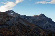
Bel endroit ! je trouve juste que le versant ombragé manque un peu de details surtout vers le bas. Un traitement local des zones sombres aurait peut être permis d'en augmenter légèrement la luminosité, donc la lisibilité.
- Thread starter
- #3
Morexp57
Member
1
- Feb 12, 2022
- 710
- 1,095
- Edit my images
- Yes
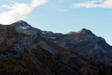
Tu as entièrement raison. J'ai fait une nouvelle version. Je mets aussi une traduction en anglais pour que les non francophone puisse comprendre.Bel endroit ! je trouve juste que le versant ombragé manque un peu de details surtout vers le bas. Un traitement local des zones sombres aurait peut être permis d'en augmenter légèrement la luminosité, donc la lisibilité.
L Leraymurat said:
Nice place! I just find that the shaded side lacks a bit of details especially towards the bottom. A local treatment of the dark areas would have perhaps allowed to increase slightly the luminosity, thus the readability.
And I answered:
You are absolutely right. I made a new version. I also put a translation in English so that the non French speakers can understand.
This also shows that you should not delete RAW files because it is always possible to improve the processing of a photo.

L
Leraymurat
New member
- Feb 18, 2022
- 13
- 17
- Edit my images
- Yes
Sorry for the untranslated message...Tu as entièrement raison. J'ai fait une nouvelle version. Je mets aussi une traduction en anglais pour que les non francophone puisse comprendre.
L Leraymurat said:
Nice place! I just find that the shaded side lacks a bit of details especially towards the bottom. A local treatment of the dark areas would have perhaps allowed to increase slightly the luminosity, thus the readability.
And I answered:
You are absolutely right. I made a new version. I also put a translation in English so that the non French speakers can understand.
This also shows that you should not delete RAW files because it is always possible to improve the processing of a photo.
View attachment 320
I like the new version much more!
M
MartinF
New member
- Apr 7, 2022
- 27
- 55
- Edit my images
- Yes
Oh, that new version really lifted compared to the first one! I would even go further with the dodge/burn tool to reveal those highlights in the trees in the lower part.
L
Leraymurat
New member
- Feb 18, 2022
- 13
- 17
- Edit my images
- Yes
Here is a perfect version. How to process your photos is really part of the photographer's job and especially that you should never get rid of your RAW! Well done!Oh, that new version really lifted compared to the first one! I would even go further with the dodge/burn tool to reveal those highlights in the trees in the lower part.
