C
Chavezshutter
New member
- Feb 4, 2022
- 142
- 194
Hi,
I wanted to do a write up of an editing tip I use often in my landscapes. Before I start I need to outline some things. I am basing this on Lightroom as that is what I use to edit the majority of my photos but I am sure the same technique can be used on other editing software. The technique itself is very simple to do but it is important to understand how it works so you can make the most out of it (For those that simply want to see the technique, please jump to The technique section below). It is worthwhile exploring because it teaches the photographer a lot about colour science, how to manipulate colour science and even emulate the colours of another camera brand when you become more experienced with it. It is useful to deal with colour casts in photos. I even use this trick to make vintage lenses look modern and vice versa. This method of editing also gives countless more editing options which are more unique than regular Lightroom presets and can be incorporated into any existing editing style and photography, its a very poweful, and useful technique specially combined with HSL but enough of that - lets begin:
Colour science - I believe most of us in the forum are aware of colour science is but for those who are not, colour science is simply the colours a camera manufacturer chooses to represent a colour. If we think of RGB, we know that this is red, green and blue but each manufacturer will not use the exact same hue of red, green and blue to make an image. One manufacturer might have a blue that leans more towards purple while another might have an almost teal look. This is what gives each camera brand its unique look to their images.
Colour Calibration - In Lightroom by default the colour calibration is the bottom panel in the Develop module, it is simply named Calibration just to avoid confusion:
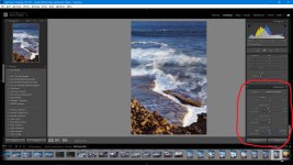
Most people including myself for a long time don't do too much with this panel, some may adjust these to suit their camera's colours. When we alter a colour through the Calibration panel we are altering not just the colour we have picked (like in HSL) but also all the other colours which contain a percentage of this colour and this is what makes this type of editing so powerful, think of it as a global colour shift rather than a single hue being affected like what HSL changes does. There are too many ways to use this panel for editing that I can write about but instead I will give you the technique which introduced me to calibration editing.
The technique:
On your next landscape edit, specially if there are any blues and/or greens in your scene, simply raise (slide to the right) up the saturation of the blue primary channel in the Calibration panel. How far you go with it is up to you, for me I usually do at least 35+ and often way higher. If i then find that any actual blue in the photo is too strong after then I simply lower the saturation of blue in the HSL panel, this lowers only the actual blue in the photo but leaves a blue colour cast in the other colours. Here is a before and after showing the result of the technique.
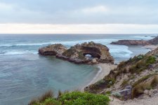
Before - basic edit with exposure, white balance, contrast, highlights, white and black points and shadows adjusted, everything else standard.
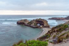
This is the same photo with +100 blue saturation added in the Calibration panel, then -42 blue reduced in saturation HSL. The effects in colour are small and it is subtle but take a close look at the foreground and the sharpness difference between the two shots. Also note the contrast, pop and depth between the shots. I didnt change any settings except the change in colour calibration and balanced that with HSL. Blue is used in this particular tip because it plays along nicely with warm tones in light (sunrise, sunsets, sunrays, etc), green would give a similar effect to the grass but can make light look very unappealing. But once you get good at editing with the Calibration panel in combination with HSL you can then use whatever you like and you have too many options to mention.
Try it for yourself, its very easy and gives very nice results. I do use it sometimes with vintage glass if I feel I want less vintage and more modern looks, but I will post something on that later on another thread. Good luck and if you do try it , I would like to hear what you think of it.
I wanted to do a write up of an editing tip I use often in my landscapes. Before I start I need to outline some things. I am basing this on Lightroom as that is what I use to edit the majority of my photos but I am sure the same technique can be used on other editing software. The technique itself is very simple to do but it is important to understand how it works so you can make the most out of it (For those that simply want to see the technique, please jump to The technique section below). It is worthwhile exploring because it teaches the photographer a lot about colour science, how to manipulate colour science and even emulate the colours of another camera brand when you become more experienced with it. It is useful to deal with colour casts in photos. I even use this trick to make vintage lenses look modern and vice versa. This method of editing also gives countless more editing options which are more unique than regular Lightroom presets and can be incorporated into any existing editing style and photography, its a very poweful, and useful technique specially combined with HSL but enough of that - lets begin:
Colour science - I believe most of us in the forum are aware of colour science is but for those who are not, colour science is simply the colours a camera manufacturer chooses to represent a colour. If we think of RGB, we know that this is red, green and blue but each manufacturer will not use the exact same hue of red, green and blue to make an image. One manufacturer might have a blue that leans more towards purple while another might have an almost teal look. This is what gives each camera brand its unique look to their images.
Colour Calibration - In Lightroom by default the colour calibration is the bottom panel in the Develop module, it is simply named Calibration just to avoid confusion:

Most people including myself for a long time don't do too much with this panel, some may adjust these to suit their camera's colours. When we alter a colour through the Calibration panel we are altering not just the colour we have picked (like in HSL) but also all the other colours which contain a percentage of this colour and this is what makes this type of editing so powerful, think of it as a global colour shift rather than a single hue being affected like what HSL changes does. There are too many ways to use this panel for editing that I can write about but instead I will give you the technique which introduced me to calibration editing.
The technique:
On your next landscape edit, specially if there are any blues and/or greens in your scene, simply raise (slide to the right) up the saturation of the blue primary channel in the Calibration panel. How far you go with it is up to you, for me I usually do at least 35+ and often way higher. If i then find that any actual blue in the photo is too strong after then I simply lower the saturation of blue in the HSL panel, this lowers only the actual blue in the photo but leaves a blue colour cast in the other colours. Here is a before and after showing the result of the technique.

Before - basic edit with exposure, white balance, contrast, highlights, white and black points and shadows adjusted, everything else standard.

This is the same photo with +100 blue saturation added in the Calibration panel, then -42 blue reduced in saturation HSL. The effects in colour are small and it is subtle but take a close look at the foreground and the sharpness difference between the two shots. Also note the contrast, pop and depth between the shots. I didnt change any settings except the change in colour calibration and balanced that with HSL. Blue is used in this particular tip because it plays along nicely with warm tones in light (sunrise, sunsets, sunrays, etc), green would give a similar effect to the grass but can make light look very unappealing. But once you get good at editing with the Calibration panel in combination with HSL you can then use whatever you like and you have too many options to mention.
Try it for yourself, its very easy and gives very nice results. I do use it sometimes with vintage glass if I feel I want less vintage and more modern looks, but I will post something on that later on another thread. Good luck and if you do try it , I would like to hear what you think of it.
Last edited: