You are using an out of date browser. It may not display this or other websites correctly.
You should upgrade or use an alternative browser.
You should upgrade or use an alternative browser.
The member has asked criticism on his/her photo(s), please leave a constructive feedback.
Morexp57
Member
1
- Feb 12, 2022
- 710
- 1,095
- Edit my images
- Yes
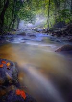
I have always loved the forest and the rivers. So I am fulfilled with this picture!
I really like the atmosphere of this landscape. The top half is reminiscent of summer and the bottom half of fall. Great job!
I really like the atmosphere of this landscape. The top half is reminiscent of summer and the bottom half of fall. Great job!
Andy Smith
Member
1
- Feb 10, 2022
- 568
- 848
- Edit my images
- No
Really nice shot here guanck, I love the water and the slight misty background, they work well together. The leaves in the foreground add a nice sharp colour compliment against the blue rocks and green foliage. The lines of the stream draw me deep into the centre of the image, which is wonderful and there is enough detail and interest to keep me involved for a while, looking around.
If I were to have any critique at all (and it is very minor) and that would be that I would like to have seen a little more of the tree tops, but like I said that is very minor and just me trying to find something to critique
Very, very nicely done and a really great image.
If I were to have any critique at all (and it is very minor) and that would be that I would like to have seen a little more of the tree tops, but like I said that is very minor and just me trying to find something to critique
Very, very nicely done and a really great image.
M
MartinF
New member
- Apr 7, 2022
- 27
- 55
- Edit my images
- Yes
That top half is good enough to be its own photo, cropped to landscape! Awesome!
G
Guest 183
New member
- Jun 29, 2022
- 21
- 47
Hi Guanck, lots to like about this image my eyes are drawn through the image from the foreground rocks with the red leaves right through to the blink of sunshine and background mist. I am somewhat concerned by the abrupt colour change in the water half way up the image. The white water in the middle of the image is distinctly blue at odds with the white water a few metres upstream. The blues throughout the image look a little oversaturated to me as well. A good composition and plenty of interest throughout but a couple of odd colour blotches especially at the top 1/3rd in on the left. It looks as though you have tried to darken some sky and this is very difficult to make look natural, perhaps a tiny bit of content aware fill, or clone in some surrounding leaves would look better or just crop a little off of the top. Ken
Last edited:
