You are using an out of date browser. It may not display this or other websites correctly.
You should upgrade or use an alternative browser.
You should upgrade or use an alternative browser.
The member has asked your opinion about his/her photo(s) attached in the topic.
- Admin
- #2
Jack
Photo Shooter :)
Staff member
1
1
1
- Jan 29, 2022
- 1,726
- 1,338
- Edit my images
- Yes
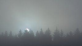
this photo reminds be about some horror movies
 Morexp57 .
But yes, the composition is great, simple and scary
But yes, the composition is great, simple and scary
- Thread starter
- #3
Morexp57
Member
1
- Feb 12, 2022
- 710
- 1,095
- Edit my images
- Yes
Thanksthis photo reminds be about some horror moviesMorexp57 .
But yes, the composition is great, simple and scary
It's true that the photo can give off a horror movie vibe!
The funny thing is that this place is very close to a zoo. It can happen (it was not the case this day) that we hear a tiger roaring or a wolf howling... This adds to the atmosphere!
- Admin
- #4
Jack
Photo Shooter :)
Staff member
1
1
1
- Jan 29, 2022
- 1,726
- 1,338
- Edit my images
- Yes
Must be scary walking around there during the night I guessThanksJack.
It's true that the photo can give off a horror movie vibe!
The funny thing is that this place is very close to a zoo. It can happen (it was not the case this day) that we hear a tiger roaring or a wolf howling... This adds to the atmosphere!
panos_adgr
Member
1
- Feb 8, 2022
- 513
- 870
- Edit my images
- No
Love it
 Morexp57 !
It is minimal with very nice soft 'mood' !
Personal comment and of course subjective is that it would work better for my eyes if the tree line was lower in the image and not in the middle. But as I said it is a subjective comment. Each artist / creator has his / hers own personal view at any given photographic instance.
- Thread starter
- #6
Morexp57
Member
1
- Feb 12, 2022
- 710
- 1,095
- Edit my images
- Yes
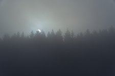
I have tried your idea and I agree with you. What do you think of this version?Love itMorexp57 !
It is minimal with very nice soft 'mood' !
Personal comment and of course subjective is that it would work better for my eyes if the tree line was lower in the image and not in the middle. But as I said it is a subjective comment. Each artist / creator has his / hers own personal view at any given photographic instance.

panos_adgr
Member
1
- Feb 8, 2022
- 513
- 870
- Edit my images
- No
Hello dear friend
 Morexp57 !
I try to avoid commenting other people photos. The reason is that each individual has a way to look at thinks and must be respected. Photography has to do with personal observation and expression, artistically or interpretational.
Thanks for the feedback. It looks a lot better to my eyes and personally I would give a bit more space to the trees. Just a tiny bit. But now it looks a lot better. The sun which is in the upper part of the tree line together with the more ilimonated area creates a more positive and aesthetically pleasing space which creates a sense of protagonistic role. The darker part adds as a nice negative space which is better to have the least space due to its more substantial contrast role. The rule of thirds aesthetically would apply perfectly in your image.
And again I note that these comments are my personal subjective observation and are written with respect to your photo and choices. 😉👍
- Thread starter
- #8
Morexp57
Member
1
- Feb 12, 2022
- 710
- 1,095
- Edit my images
- Yes
Feel free to criticize or suggest changes in my photos. I learn this way. That's also why this forum exists!Hello dear friendMorexp57 !
I try to avoid commenting other people photos. The reason is that each individual has a way to look at thinks and must be respected. Photography has to do with personal observation and expression, artistically or interpretational.
Thanks for the feedback. It looks a lot better to my eyes and personally I would give a bit more space to the trees. Just a tiny bit. But now it looks a lot better. The sun which is in the upper part of the tree line together with the more ilimonated area creates a more positive and aesthetically pleasing space which creates a sense of protagonistic role. The darker part adds as a nice negative space which is better to have the least space due to its more substantial contrast role. The rule of thirds aesthetically would apply perfectly in your image.
And again I note that these comments are my personal subjective observation and are written with respect to your photo and choices. 😉👍
panos_adgr
Member
1
- Feb 8, 2022
- 513
- 870
- Edit my images
- No
Thank you. I will.😊Feel free to criticize or suggest changes in my photos. I learn this way. That's also why this forum exists!
It is just that I have participated many years in other forums where people used to criticize other people photos by saying to others that 'I would do this or that' or that 'this is right'....
People don't have the ability to understand that in art an artists expresses his / hers self in its own way through their own prism of emotional and artistic perception and understanding. And I don't want to be like them. 😉
That's all.
